Tuesday, December 27, 2011

Post-Merry Christmas to all!

Had so much fun making the Christmas garland that I asked a friend if she wanted one, too. The answer was "yes," but she wanted one not just for Christmas, but to keep out all year 'round...a fabric sculpture. So, I put together a beautiful thoughtfully composed patchwork background color coordinated with her living room onto which I sewed a few simple 'rustic' roses inspired by the wonderful works of a Scottish woman artist at the end of the 19th-beginning of the 20th century named Margaret MacDonald...More......

Margaret was married to Charles Rennie Mackintosh, a famous and talented Scottish architect, whose career and work probably felt the influence of his equally talented wife. For more info on her try here: http://www.scotland.org/features/item/margaret-macdonald/ and here: http://www.huntsearch.gla.ac.uk/cgi-bin/foxweb/huntsearch_Mackintosh/summaryresults.fwx?searchterm=manufac+has+margaret+macdonald&browseMode=on&browseSet=Margaret+Macdonald.

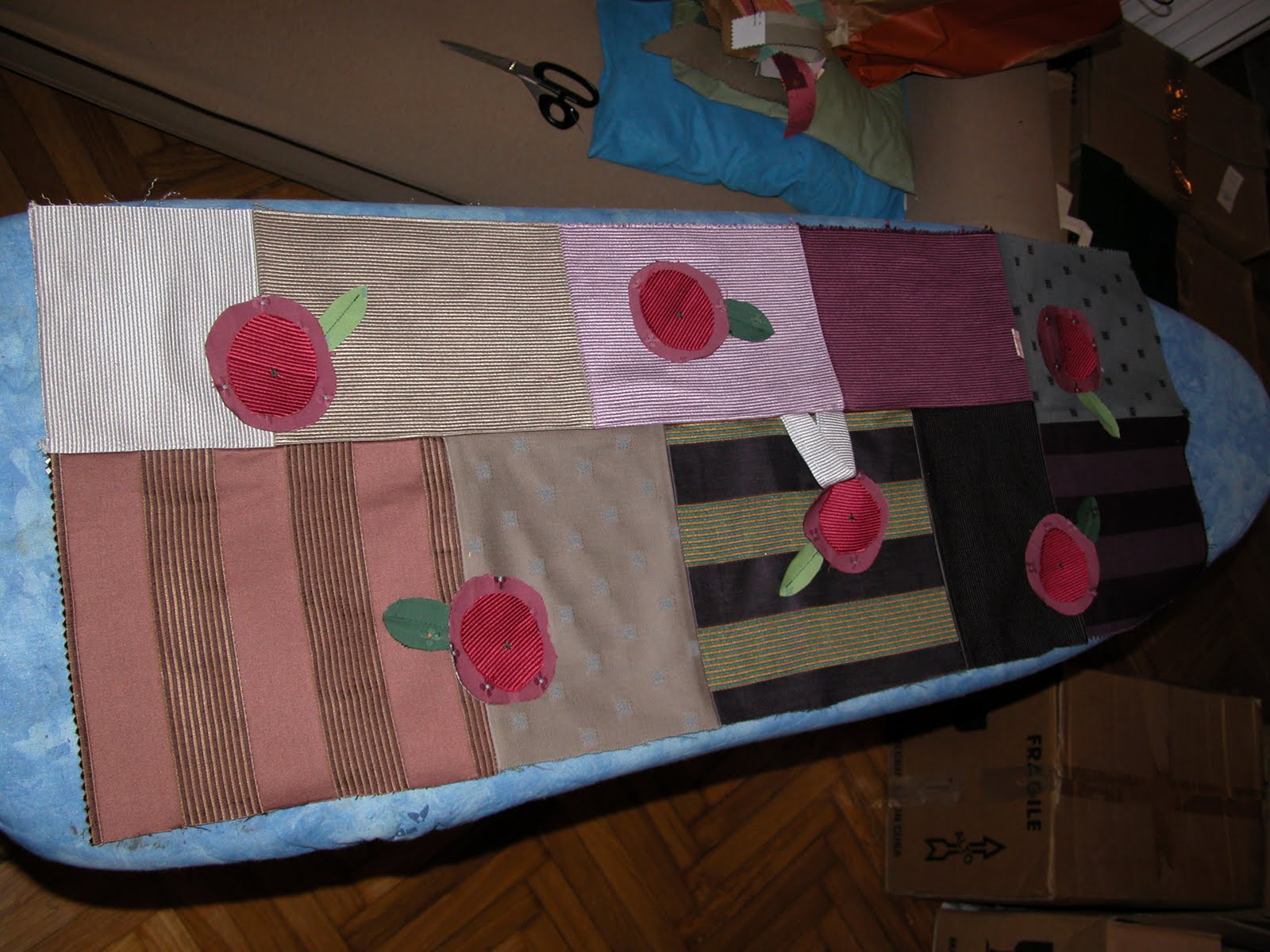
I love the contrast between the sophisticated fabrics and colors and careful sewing of the background with the roses, edges unfinished, a bit 'rustic.'

The patchwork, complete with roses, was sewn into a tube, right sides together, leaving a good 7, or so, inches free at each end to facilitate the sewing of the short end together.

Then the donut-shaped object was fluffed up with stuffing, and the long slit closed. VoilĂ ! It will be a garland of roses for a little abstract horse sculpture in simple lines.

I can't wait to take it to her!

Enjoy!

Friday, December 23, 2011

A bit of Christmas sewing

Have been working like a mad woman for almost three months. Here we are just before Xmas. Offices closed and deadlines met. I'm finally freeeeeee!

What was my first thought, lengthy needlepoint aside?

Sewing and baking, of course!...More......

Baking? Makes my mouth water just to hear the word. I had promised friends real Toll House Chocolate Chip cookies, and the batch came out just fine, as proven by the very necessary taste test: http://mymilanitaly.blogspot.com/2011/12/christmas-promises-and-toll-house.html.

But that doesn't have much to do with needlepoint, does it?

Given the extreme lack of time...I finished work projects just two days before a lunch appointment to which I wanted to take a handmade love gift...out came the sewing machine instead of the needlepoint needle. On the TO DO sheet, a patchwork stuffed hen and a patchwork stuffed Christmas garland: http://mymilanitaly.blogspot.com/2011/12/fun-of-giving-love-gifts.html.

Sketched the hen, then cut the sketch into pattern bits, then cut those out. Didn't forget a gusset to make her tummy nice and puffy!

Sewed the two complete halves, first, comb, beak and gusset, before sewing those together, including the two long yellow wattles just under her little beak.

Then I turned her inside out, stuffed her, and closed up the long slit along one side of the gusset that I had left open just for this purpose.

The garland was fun, too.

I sewed together the green patches, artfully placed, into a long rectangle. Onto the rectangle, I top sewed (with long stitches in a gold-colored thread) the "bulbs."

Here comes the semi-tricky part.

I turned the fabric to put the long right side together, and sewed along the length, taking care to avoid sewing the first five inches or so on both sides (you'll see why in a minute).

Then I turned it right side out, and--facilitated with the opening left by not sewing all the way to the ends--I put the right sides together of the two short ends, and sewed them together, then ironed down the seam allowance of the opening.

Now it was ready for stuffing and--once nicely full, but not too stuffed (so that the wrinkles cast shadows like the uneven surfaces of the garland branches)--top sewing down the opening where I had nicely ironed the seam allowances as guides.

And...voilĂ ! (On a roll, so I made one for myself, too!)

Thank you so much for reading my blog.

Merry Christmas and a Happy, Healthy and Prosperous New Year to all!

Thursday, December 8, 2011

Have you been good, or bad? Santa's making his list!

Santa's frantically finishing his toy list...have you been good, or bad, this year?

(Thanks, Microsoft, for the free clip art. This one is MC900285786, which I turned first into a StitchPainter diagram then into a BMP file to share with you here freely for your personal non-commercial stitching pleasure.)

Enjoy! and Merry Christmas!

Sunday, December 4, 2011

Xmas gifts and candy cane

Winding our way to Xmas, here's a small do-able image of presents and a candy cane thanks to the free images of Microsoft clip art (thanks, guys!). I uploaded it into my StitchPainter program, and turned it into a BMP for your personal, non-commercial stitching pleasure.

Enjoy!

Sunday, November 20, 2011

T-Day cornucopia


A bit of time left before T-Day, and what's this holiday without reflection on our blessings, even in adversity, so here's a cornucopia dedicated to...More......

...those who don't have enough to eat, and those who do...who share.

Thank you, Microsoft, for freely sharing your clipart. This is drawn from the MC900354064 image. I uploaded it into StitchPainter, turned it into a diagram, then into a BMP to share with you here for your personal non-commercial stitching pleasure.

Enjoy!

Sunday, November 13, 2011

More T-Day...one of my all time favorites: pumpkin pie

I love T-Day. It's my favorite holiday. One of my favorite things about my favorite holiday is fresh pumpkin pie. Seen here with a lovely cup of tea. And a dollop of whipped cream.

Go for it, it's a holiday....More......

Be calorie conscious tomorrow.

I took the free Microsoft clip art image MC900233497 (thank you, Microsoft!), and turned it into a StitchPainter diagram, and then into this bmp to share with you freely for your personal non-commercial stitching fun.

You still have a couple of weeks til the day!

Hugs from T-Day-less Milan, Italy (sniff! sniff!), enjoy!

Sunday, November 6, 2011

Thanksgiving-Pilgrim hats (cute without being too sugary)

Finding designs that are cute, but not too sugary, isn't easy.

I think this one from the Microsoft free clip art site (MC900413706, thanks Microsoft!) hits the mark, and it adapted well to being a StitchPainter diagram, which I then turned into a BMP image to share with your for your personal non-commercial use.

Just in time to get some stitchin' done before T-Day!

Enjoy!

Thursday, November 3, 2011

Frosty the Snowman for more holiday cheer


Here's another pattern of Christmas cheer...Enjoy!
(Microsoft, thank you, again, for your free graphics...this one's called "inverno"...turned into a StitchPainter diagram, then a BMP to post here for your personal non-commercial use, thanks.)

Saturday, October 22, 2011

Christmas is nearer than you think...


It may be the second half of October, but considering how long it takes to do needlepoint projects, Christmas is nearer than you think.

So here's an adorable mouse I adapted from a free animated gif, turned first into a StitchPainter diagram then into a BMP image for your personal, non-commercial use (for any other use, please contact BOTH me AND the source of the image):

http://www.webweaver.nu/clipart/christmas-food.shtml

Enjoy!

Sunday, October 9, 2011

My latest project...in black and white...to see the 2-D / 3-D effect better

To help you see the 2-dimensional / 3-dimensional "push-me-pull-you" effect of my latest project, I turned it into a black-and-white photograph....More......


See how the background merges with the shadows, even those between the cracks in the feathers and those falling from underneath one feather over the top of the next feather down?

This seemingly simple, but actually quite challenging type of design was inspired by the wonderful work of the Beggarstaff Brothers (who weren't called Beggarstaff, and who weren't brothers, but brothers-in-law) at the turn-of-the-last century: http://arsacupicturaestellae.blogspot.com/2010/08/meteoric-brothers-revolutionize-art.html

Just in case you're new to the blog, and wondering how it looked in color: (http://arsacupicturaestellae.blogspot.com/2011/09/wordless-wednesday-27.html)

Enjoy!

Monday, October 3, 2011

Milan Monday (44): an urban lakeside scene, complete with little temple and swan!

I know, I know...most of my designs are horribly complicated.

Or they LOOK horribly complicated.

Why's that?...More......

Because I'm frantically busy, like all of you, so can't stop to simplify the images simply imported into my StitchPainter program.

Use my designs to inspire you, to set out proportions, to give you a clue of colors.

Then simplify at will.

Here's another good example.

I'd go crazy if I needlepointed this just as it is: a gorgeous urban lakeside scene, complete with decorative temple and swan.

I took my photo, uploaded it into StitchPainter, and turned it into a diagram and then a BMP image to share with you for your personal, non-commercial stitching fun.

If you're interested in knowing more about what it is and where it is in Milan, go to my other blog, My Milan (Italy): http://mymilanitaly.blogspot.com/2011/10/gorgeous-tempietto-on-urban-lakeside-in.html.

Enjoy!

Thursday, September 29, 2011

Photoless Friday (28): What else? More Owen Jones!

Hi, there! It's photoless Friday, again, already! Yup! More great design advice from Owen Jones!

PROPOSITION 28: [color, cont.] Colours should never be allowed to impinge upon each other.

What do you think he meant by that?

When we're done contemplating his design advice, we'll examine it, and try out some examples.

Enjoy!

Monday, September 26, 2011

Milan Monday (43): a lovely lady in a 1930s mosaic


In honor of women's fashion week in Milan, here's a lovely lady in a 1930s mosaic for the 43rd Milan Monday.

If you want to know more about the image and the photo, see my other blog, My Milan (Italy): http://mymilanitaly.blogspot.com.

I captured my photograph, imported it into StitchPainter, then turned it into a BMP to share with you for your personal non-commercial stitching pleasure.

Enjoy!

Thursday, September 22, 2011

Photoless Friday (27): back to good ol' Owen Jones and his great design advice

More great design advice from Owen Jones...and the proposition numbers are back in sync with the Photoless Friday numbers...a small silly tidy thrill:

PROPOSITION 27: [color, cont.] Black grounds suffer when opposed to colours which give a luminous complementary.

Monday, September 19, 2011

Milan Monday (42): the Sforza crest, have buckets will travel

Like family crests? Here's a good one for you straight from the Sforza Castle for Milan Monday.

This diagram, for your personal non-commercial enjoyment, was created by uploading one of my own photos into StitchPainter, then transforming the diagram into a BMP to share with you, here. If the whole thing is too complex, think about working up one of the quarters of the crest, instead.

If you want to know more about the crest and the castle, go to my blog on Milan: My Milan (Italy): http://mymilanitaly.blogspot.com.

Enjoy!

Saturday, September 17, 2011

Halloween and Fall...whichever floats your boat


Fall is right around the corner...this afternoon, in fact. Wishful thinking, maybe, because it's been soooo very hot and humid this summer, but we're getting a bit of relief, whether it's a late summer storm, or an early fall one, it doesn't matter. It did, however, put me in the mood for falltime designs, so you can get started for Halloween and the season...More......

For those of you, who don't like anything to do with Halloween (for whatever your reason), this design is easily transformed into something generic for fall: just don't do the jack-o-lantern face on the pumpkin.

As usual, I'm happy to credit the source of the image that I captured, uploaded into StitchPainter, then turned into a BMP to share with you. It's the clipart image MC900250122 from the free Microsoft clipart pages for your personal, non-commercial stitching.

Enjoy!

Friday, September 9, 2011

Photoless Friday (26) and StitchPainter: a break from Owen Jones (whew!)

Maybe you'd like a bit of a break from all that wonderful design advice coming from Owen Jones' "Grammar of Ornament," so I thought I'd give you two hints about other sources for help and inspiration that are related to the StitchPainter program I use....More......

The company, which--for you sewers--also makes GarmentDesigner, is called "Cochenille Design Studio," and it has a web site, a blog and a discussion group.

Web site: http://www.cochenille.com/

Blog: http://cochenilledesignstudio.blogspot.com/ (Very kindly, they have included my "Ars acupicturae stellae" tweets in their tweet box.)

Discussion group (in Yahoo Groups): DesignerSchool. I'd particularly like to encourage all of you doing hand-done cross-stitch and needlepoint to buy their marvelous program, and join in the discussion because--remembering that I get no kick-backs of any kind for any mention of any products--I'm almost the only StitchPainter person in that group, and I'm lonely! Everyone talks about GarmentDesigner (and it makes me want to take up sewing, again), but I'd like a little needlepoint company!

Hope to be seeing you, soon, in the discussion group!

Monday, September 5, 2011

Milan Monday (41): the city's logo

Can't get the copy-paste function to work in my Paint program...necessary to get stuff into my StitchPainter program...just one of the many little SNAFUs lying in wait for me after a couple of days of much needed R&R...this way, they can get me all stressed back up to normal before I pelt into the rest of the work year, it's like a favor they're doing for me, get it? (I don't.)

So, today's "Milan Monday" will just have to go without a diagram. The image should be easy enough to print and trace, anyway. City logos often have a city-wall-crown over them; you can substitute Milan's theme on the shield with anything of your own.

My Milan (Italy): http://mymilanitaly.blogspot.com/2011/09/just-back-to-workand-already-theres.html

Here's hoping that your fall starts out better than mine is!

Friday, August 26, 2011

Photoless Friday (25):...yup...Owen Jones on color!

More thought-provoking design advice from Owen Jones'"The Grammar of Ornament":

PROPOSITION 26: [color, cont.] Colours on white grounds appear darker; on black grounds lighter.

Ponder and enjoy!

Monday, August 22, 2011

Milan Monday (40): a lovely 1930s snippet


A lovely 1930s snippet for your personal, non-commercial needlepointing and/or cross-stitching.

As usual, I took a snap, then used StitchPainter to turn it into a diagram, then turned it into a BMP for sharing with you.

If you'd like more info about the snap, go to my blog on Milan, My Milan (Italy):

http://mymilanitaly.blogspot.com

Enjoy!

Friday, August 19, 2011

Photoless Friday (24):...you guessed it...more Owen Jones on color

We're heading into the home stretch, really we are!

Here is the next design advice snippet from Owen Jones' "Grammar of Ornament":

PROPOSITION 25: [color, cont.] When two different colours are juxtaposed, they receive a double modification; first, as to their tone (the light colour appearing lighter, and the dark colour appearing darker); secondly, as to their hue, each will become tinged with the complementary colour of the other.

When we finish going through them all, and you've had time to think about each of them and "digest" them, we'll try some designing experiments together.

'Til the next Photoless Friday...Enjoy!

Monday, August 15, 2011

Milan Monday (39): a snippet of Art Deco


A snippet of Milanese Art Deco for this Milan Monday.

I took one of my snaps, turned it into a StitchPainter diagram, and then into a BMP image for your personal, non-commercial enjoyement.

If you're interested in knowing more about the image, see my blog on Milan:

My Milan (Italy): http://mymilanitaly.blogspot.com

Enjoy!

Friday, August 12, 2011

Photoless Friday (23): More...Owen Jones (surprise!)

More Owen Jones...surprise!

We're working our way through what I consider to be the more important snippets of great design advice found in his "Grammar of Ornament." (He should have asked me to edit this list before he published it, there's some repetition, only I would have had to have been born more than a hundred years earlier, and my parents hadn't met, yet.)

Today's snippet is:

PROPOSITION 24: [color, cont.] When two tones of the same colour are juxtaposed, the light colour will appear lighter, and the dark colour darker.

Monday, August 8, 2011

Milan Monday (38): a Renaissance family crest


Like heraldic imagery?

Here's a family crest for you, from the right hand side of a mid 15th century portal in Milan.

I isolated the detail of my photo, and turned it into a StitchPainter diagram, then into a BMP to share with you for your personal, non-commercial enjoyment.

If you want to know more about the doorway, go to my previous (fairly recent) post:
http://mymilanitaly.blogspot.com/2011/08/bookworms-epigraphy-and-luck-of-non.html.

Enjoy!

Friday, August 5, 2011

Photoless Friday (20): More Owen Jones (out of chronological order, to get us back on track...)

We were up to the published Photoless Friday note n. 22, and the "label" number wasn't tallying.

Hunting here and there, I finally realized that I had skipped n. 20! Sorry!

So, here's more Owen Jones (what else?) on color (what else?), to get us back on track...thanks for your patience!

PROPOSITION 23: [color, cont.] No composition can ever be perfect in which any one of the three primary colours is wanting, either in its natural state or in combination.

Monday, August 1, 2011

Milan Monday (37): another lion!


Milan Monday, again, already! Time has been flying, I've been so busy at work. Now that it's vacation time, I hope to spend more time with you.... More...

To kick things off, here is another lovely lion on the façade of the Palazzo dei Giuresconsulti in Milan (if you want to know more about the building, see my other blog: http://mymilanitaly.blogspot.com/2011/08/lion-motif-corbel-on-palazzo-dei.html#0).

I turned my photo into a StitchPainter diagram, then into a BMP to share with you for your personal, non-commercial enjoyment.

On an 18-point canvas, it should work up to be about 16" wide by 14" tall.

Hope you like it!

Friday, July 29, 2011

Photoless Friday (22): more...quess what?!...Owen Jones!

More color advice from Owen Jones (don't get frightened, we're back to the intelligible stuff):

PROPOSITION 22: [color, cont.] The various colours should be so blended that the objects coloured, when viewed at a distance, should present a neutralized bloom.

Monday, July 25, 2011

Milan Monday (36): a frame for your own designs

Whew! That was quite an intensive and long stretch of non-stop work. Thanks for hanging in there!

As a thanks, here's another Milan Monday, this time ready for your own designs front, center...More......

...and sides!


It's a detail of an architectural fragment in Milan. If you're interested, you can see more about it on my blog dedicated to Milan, My Milan (Italy): http://mymilanitaly.blogspot.com/2011/07/yeah-worst-is-over-for-nowim-such.html

Friday, July 15, 2011

Photoless Friday (21): More Owen Jones (this one's a mouthful...hang in there!)

Workin' so hard, would so love to chat and "digest" together with you these great design hints from Owen Jones, but that will have to wait 'til the work load lightens up. For now, here's a whalloping big snatch of his complicated color advice...More......

The other indications about color are easier to understand. These snippets are hard on the brain, but we'd might as well get them out of the way, so we can continue our tour through his advice.

At the end, we'll try to make some sense of what he's told us, and try using it, ourselves, together.

Are your seatbelts fastened? Here goes...!

PROPOSITION 18: (Field’s Chromatic equivalents) The primaries of equal intensities will harmonise or neutralize each other, in the proportions of 3 yellow, 5 red, and 8 blue – integrally as 16. The secondaries in the proportions of 8 orange, 13 purple, 11 green – integrally as 32. The tertiaries, citrine (compound of orange and green), 19; russet (orange and purple), 21; olive (green and purple), 24; -- integrally as 64. It follows that, -- each secondary being a compound of two primaries is neutralized by the remaining primary in the same proportions: thus, 8 of orange by 8 of blue, 11 green by 5 of red, 13 of purple by 3 of yellow. Each tertiary being a binary compound of two secondaries, is neutralized by the remaining secondary: as, 24 of olive by 8 of orange, 21 of russet by 11 of green, 19 of citrine by 13 of purple.

PROPOSITION 19: [color, cont.] The above supposes the colours to be used in their prismatic intensities, but each colour has a variety of tones when mixed with white, or of shades when mixed with grey or black. When a full colour is contrasted with another of a lower tone, the volume of the latter must be proportionally increased.

PROPOSITION 20: [color, cont.] Each colour has a variety of hues, obtained by admixture with other colors, in addition to white, gray, or black: thus we have of yellow, -- orange-yellow on the one side, and lemon yellow on the other; so of red, -- scarlet-red, and crimson-red; and of each varity of tone and shade. When a primary tinged with another primary is contrasted with a secondary, the secondary must have a hue of the third primary.

PROPOSITION 21: [color, cont.] In using the primary colours on moulded surfaces, we should place blue, which retires, on the concave surfaces; yellow, which advances, on the convex; and red, the intermediate colour, on the undersides; separating the colors by white on the vertical planes. When the proportions required by Proposition 18 cannot be obtained, we may procure the balance by a change in the colours themselves: thus, if the surfaces to be coloured should give too much yellow, we should make the red more crimson and the blue more purple, -- i.e., we should take the yellow out of them; so if the surfaces should give too much blue, we should make the yellow more orange and the red more scarlet.

Ouch! (The rest of his hints are more straight forward, like the first ones we have seen, so don't worry!)

Back atcha' later, enjoy!

Monday, July 11, 2011

Milan Monday (35): summertime waterside fun


People who do my kind of work (including translations and text revisions) get the worst loads dumped on them at this time of year (and just before Xmas) because everyone else is winding down for the summer.

Gotta run, but didn't want to leave you without at least a quick "Milan Monday," in honor of all the activities, including sandy fun, planned at Milan's artificial lake, the "Idroscalo" ("Water landing")...so called because it originally was intended for a landing for seaplanes: begun in 1928 in a giant hole in the ground (results of digging for gravel and sand), built in 1935-36, enlarged in 1958-63 and revised in the 1990s.

For more info about this summer's activities there, see my: http://mymilanitaly.blogspot.com/2011/07/photoless-friday-29-whats-on-in-milan.html.

I created this summertime fun needlepoint diagram based on a free clipart of Microsoft (MC900024619) by uploading it into StitchPainter, then changing it into a BMP to share with you for your personal, non-commercial fun.

Enjoy!

Friday, July 8, 2011

Photoless Friday (19): still workin' on Owen Jones

Still working our way through Owen Jones' design advice:

PROPOSITION 17: The primary colours should be used on the upper portions of objects, the secondary and tertiary on the lower.

Monday, June 27, 2011

Milan Monday (34): Wings for your new week


Doesn't seem possible, the weeks just fly by: it's Milan Monday, already, again.

Here's a stunning Pegasus I created by capturing one of my photos, turning it into a StitchPainter diagram, then into a BMP for your personal non-commercial use, to wing you on your happy fruitful way for the week.

If you'd like to know more about the image, see my blog My Milan Italy: http://mymilanitaly.blogspot.com

Enjoy!

Sunday, June 26, 2011

Why do I needlepoint (gifts)?

Why do I needlepoint? I answered that in my first ("Welcome") post: http://arsacupicturaestellae.blogspot.com/2010/06/welcome-first-post.html#0.

But why do I needlepoint gifts?...More...

Gotta do something other than fill my own house with cushions: http://arsacupicturaestellae.blogspot.com/2011/02/surely-im-getting-unpacked-bitonly-bit.html.

But, seriously, it's a productive way to express not just my creativity as best as I can manage, but it also has that old-fashioned pleasure of thinking about what might please the other person, designing it, then actually making it myself.

Here, I had the "bright" idea to make Xmas gifts--all alike, to avoid jealousies (yeah, right)--for my colleagues at work. What had begun as sunglasses cases rapidly turned into (half the size) sachets for undies and stockings drawers, and even so I only managed to finish the designing, needlepointing and hand-finishing the subsequent Easter time. (Note to self: NEVER do that, again.)

Really, though, each stitch is like spending time with that person, thanking them, hugging them. Sometimes (often?) it means more to me than it does to them...and for that reason I keep my gifts small enough to be stuck away in the bottom of a drawer, if so desired: http://arsacupicturaestellae.blogspot.com/2010/06/most-recent-completed-project-thank-you.html (P.S., she loved it, thankfully, and keeps it in her office, where she can see it).

Why all this mushy stuff? Because looking at my calendar, I realized that, thanks to being innundated with Life and Work, my first Ars acupicturae stellae-Star's Needlepoint Art anniversary went by without me noticing: I did the first post on the 12th of June 2010. Does not seem possible.

Thank you to the "vast" crowd, who regularly follow me, to those who might be regular lurkers, and to those checking in now and again.

Writing for you and sharing my hand-done needlepoint love, StitchPainter thoughts and grids, designs and works with you has been very wonderful for me. I hope it was and continues to be for you, too.

Thanks.

Friday, June 24, 2011

Photoless Friday (18): still working our way through important design thoughts to ponder in Owen Jones' book

"PROPOSITION 16: These object[ive]s are best attained by the use of the primary colours on small surfaces and in small quantities, balanced and supported by the secondary and tertiary colours on the larger masses."

Sunday, June 19, 2011

Now you can see how long it takes...

Another snap of my work-in-progress. After a long day of work, and a quick dinner, I look forward to a good movie, or TV program, and an evening of needlepoint.

After those three, or so, hours of stitching, I've covered perhaps three square inches, if I'm lucky (the stitches are small...18 point).

One reason why there isn't a lot of chatting on this blog...but I hope you enjoy it, anyway. When my daytime work schedule begins to interfere less with my fun (!) in summertime, I hope to get back to sharing more thoughts with you.

Friday, June 17, 2011

Photoless Friday (17): guess what? (More Owen Jones!)

Can't beat the design advice of Owen Jones:

"PROPOSITION 14: Colour is used to assist in the development of form, and to distinguish objects or parts of objects one from another."

Verrrrrrry Venetian in origin, as opposed to the Florentine tradition emphasizing drawing. There's plenty of that in Owen's writing, too!

Monday, June 13, 2011

Milan Monday (33): a strip of laurel

Laurel was used to honor a worthy recipient. If you have someone to congratulate for whatever grand accomplishment (a graduation, a promotion, the first book published, the first--or 100th!--hole-in-one, etc.), this strip of laurel can be adadpted for the border.

Enjoy this design that I created out of one of my own photographs imported into StitchPainter, then turned into a BMP, for your personal non-commercial use.

If you'd like to know more about the image and the photo, you can go to my blog about Milan, My Milan Italy: http://mymilanitaly.blogspot.com/2011/06/laurel-for-successful-graduations-and.html#0.

Friday, June 10, 2011

Photoless Friday (16): surprise, surprise, more Owen Jones

Here it is, Photoless Friday, already.

Time for more Owen Jones...More......

PROPOSITION 13: Flowers or other natural objects should not be used as ornaments, but conventional representations founded upon them sufficiently suggestive to convey the intended image to the mind, without destroying the unity of the object they are employed to decorate. Universally obeyed in the best periods of Art, equally violated when Art declines. [Jones’ cursive]

Huh?

Yeah, I know, his old-time language is sometimes a bit impenetrable.

Here, the meaning is simple: draw inspiration from nature, stylize (don't copy) it, and certainly don't make it into a merely decorative motif.

My spin? Try to adapt the idea to the medium and the project's end goals.

Monday, June 6, 2011

Milan Monday (32): another amazing lion

Another amazing lion...if you start looking, Milan is full of them.

In case you need a fan-shaped design, this is a good one, created for your personal, non-commercial use with my StitchPainter program out of one of my recent photos, then turned into a BMP to load onto this site.

If you want to know more about the doorknocker, go to my site about Milan: http://mymilanitaly.blogspot.com/2011/06/another-marvelous-liondoor-knocker.html.

Enjoy!

Tuesday, May 31, 2011

Milan Monday (31)...ahem...on Tuesday: more lions!


Not only does time seem to go faster and faster, but there's more and more work (which is not necessarily a bad thing, these days!). So, on Tuesday (ahem), here is the most recent Milan Monday...More......

...a delightful snarling winged lion from the back of Milan's Stazione Centrale (central train station).

If you want to know more about the photo and the building, see my blog on Milan: http://mymilanitaly.blogspot.com.

I turned one of my photos into a StitchPainter diagram for you, then into a BMP to put online, for your personal, non-commercial stitching pleasure.

Enjoy!

Related Posts Plugin for WordPress, Blogger...