Saturday, July 31, 2010

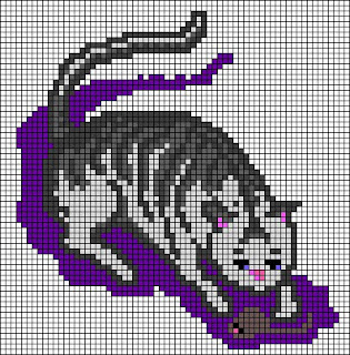
Cat and mouse (8 of 9) (again)


Of course my favorite animal, the cat, had to figure in the "composite" image. It, too,...More......was designed freehand on my StitchPainter program, and inspired by the Victorian needlepoint book; see bibliography and link list.

(Originally posted July 14, 2010, this message was skipped during Google’s retroactive indexing phase, which means that not only was it not available in internet, but also that the page was not available for the in-site search feature, so the message is being reposted to remedy these two problems. Thank you for your understanding.)

Friday, July 30, 2010

Swan (7 of 9) (again)


A peaceful gliding swan (designed freehand on my StitchPainter program,...More......and inspired by my Victorian needlepoint book; see bibliography and link list) for the "composite" image.

(Originally posted July 13, 2010, this message was skipped during Google’s retroactive indexing phase, which means that not only was it not available in internet, but also that the page was not available for the in-site search feature, so the message is being reposted to remedy these two problems. Thank you for your understanding.)

Thursday, July 29, 2010

The Devil is in the details...of designing (again)


Ever wondered why the (good) readymade needlepoint designs are so darn expensive? I did (and do), but one starts to understand why, when one carefully executes designs. Leaving aside for the moment other costs,...More......such as paying royalties to the museum or artist holding image rights, physical production & storage & shipping, personnel, PR & advertising, a bit of good old-fashioned profit and who knows what else, the design and proofing process is a lot more exacting and painstaking and time-consuming than you may have thought.

Take a look at my diagrams: at the top is the plain canvas, in the middle a design, at the bottom a simulated needlepoint of the colored "O" of the design. Note how, in the design, the "O" looks completely closed, yet, in the simulated needlepoint, there are gaps.

Remember I mentioned earlier to pay attention to materials and technique? This is an excellent example: the thickness and thinness of the lines (much more visible in real stitching), as well as the gaps, are produced by the bottom left to upper right direction of my right handed stitching (the gaps are on the opposite side for lefties).

When these thickness variations and gaps are not desirable, it takes eye-straining care and great concentration to hunt for these areas in the design, and, even then, some pop up during execution (hence, for commercial purposes, samples have to be worked). To get rid of these variances and gaps, extra stitches have to be added where you may not want them.

On the other hand, these variations in thickness and gaps also can be part of your original design. Keep them in mind, too, when using Cross Stitch patterns for needlepoint.

(Originally posted June 14, 2010, this message was skipped during Google’s retroactive indexing phase, which means that not only was it not available in internet, but also that the page was not available for the in-site search feature, so the message is being reposted to remedy these two problems. Thank you for your understanding.)

Wednesday, July 28, 2010

Time flies


Why not take advantage of the idea of the passage of time to enliven and enrich your designs? I did in my “CARPE DIEM” in which ...More......the idea of the passage of time is a reminder—in the true Stoic sense of the phrase—to take advantage of every moment of the present to be a better person, individually and socially.

It also provides a thought-provoking artistic synchronization between the concept and its presentation.

The concept reminds us to be aware in the present of the fleeting passage of time, while the needlepoint displays the passage of time. Like a snapshot (in itself evoking the sense of the present), the—for the moment, new—needlepoint depicts a detail of an ancient cracked fallen architectural fragment, invaded and surrounded by wild plants, such as the acanthus on the left, the inspiration for the leaf design found in ancient classical art, thus forcing us to note the passage of time.

It is, for me, a personal reminder to try to be a better person every day, but also my own sad comment on how this unselfishness--like a fallen architectural fragment in a field of wild plants--is forgotten, in many ways big and small, in today’s society.

The comparison between the design and the worked needlepoint also is a good example of the difference between the colors in my designs--bright, for visibility during the working phase--and in my worked pieces.

Tuesday, July 27, 2010

Searching this blog

The search feature automatically a part of this blog module works only partially (sigh). First of all,...More......it depends on the availability of the pages in Google, which is not automatic (any new blog must be signaled to Google by the blog owner, then it’s up to Google to choose which pages to include). Thankfully, when the Google technicians added my blog to their search engine, they went back all the way to the first post. Unfortunately, they skipped a few pages, all important—of course!—but one more than others (see below). Furthermore, pages available directly in Google are not available in the search feature in the blog, itself—go figure.

Therefore, in addition to using this search feature, you also might want to use Google directly from the web, for example:

arsacupicturaestellae.blogspot.com welcome

will search in my blog for any pages containing the word "welcome."

Furthermore, as of July 27, 2010, the following pages were not available directly in Google, and so are not available in the search feature of the blog, too:

July 24, 2010: "Library mouse (02)"
July 15, 2010: "Garland of roses (9 of 9)"
July 14, 2010: "Cat and mouse (8 of 9)"
July 13, 2010: "Swan (7 of 9)"
June 14, 2010: "The Devil is in the Details...of Designing" (this is a very important post)

You might want to visit them, directly, to see what you missed.

Finally, if you do use the search feature in the blog, itself, the module creators have caused it to appear at the top of this column, and I can’t see where to change that, so don’t fret if you search for something, then don’t see anything happen. Check at the top of the column for the results.

Computer problem-solving

I'm going to try another thing to force the "indexing" of messages prior to July 15, 2010. If you follow this blog, or have activated the ATOM feed, please bear with me, as, if it works, you'll be getting a repeat of the first messages (which you might not have seen, already).

Thank you for your understanding.

Monday, July 26, 2010

Search feature and a request for your suggestions

I'm very grateful to Blogger for the marvelous possibilities they offer for constructing and offering attractive and helpful blogs for free, but I need your help to solve a problem...More......The "search" feature, an automatic part of the model I chose, did not work immediately, which I found odd because it was part of the model, after all.

After reading the "help" messages, I saw that first "indexing" had to take place...a very complex-sounding procedure, which, thankfully, would happen automatically...eventually...for the newer blogs, like mine.

I just realized that my messages from the 15th of July, 2010, onward are now "indexed," and so searchable. Unfortunately, all my previous messages are not.

I had hoped that re-posting them would force them to be available to the indexing, but no such luck. I temporarily turned off the feed feature, and reposted all my messages prior to that date, and they still aren't searchable.

I put so much energy and love into all my messages that it's heartbreaking to not have them all available. Has anyone else found a way around this serious problem?

Sunday, July 25, 2010

Library mouse (02)

I feel much richer as a person for having learned more about William Morris (1834-1896). I knew of him as a...More......multi-talented artist and craftsman, but never realized that his aspirations to improve and uplift our daily lives by insisting on beauty in the making and using of everyday things also had extended into poetry, narrative and political activism. (For more on Morris, go directly to http://www.morrissociety.org.)

Arthur Clutton-Brock’s William Morris (New York: Parkstone Press International, 2007) is largely concerned with exploring Morris’ interests and beliefs, with particular attention to Morris’ own writings. The book is not dedicated to translating his art into needlepoint, or cross stitch, designs, though the ample and beautiful illustrations will be an inspiration for your work.

The book spends less time than I had hoped on analyzing Morris’ approach to art, in order to be able to apply it to our own work. Even if the style of his art may not please you, after learning about his goals, you may find that you like his art better, even if you already adored it before learning more about him, as I did.

The text, despite its in-depth attention to Morris’ writings, is not for scholars, who will lament the rambling text without footnotes and the too short bibliography, but it is suited for interested fans wishing to understand Morris’ works, better, and is a good source of some beautiful images full of inspiration for your needlepoints.

Better understanding his goals helps us to better translate his art into designs. Unexpectedly, but more importantly, it helps us, like Morris, to be uplifted by making beautiful things and to insist on living surrounded by beauty, even in all our everyday objects, not just because it gives aesthetic pleasure, but also because it refines our spirits.

Saturday, July 24, 2010

Library mouse (01)

Do you love books? Me, too. Real ones...More......that you can hold and touch and annotate and in which you easily can hold your place flipping back and forth to coordinate information on the various pages (that’s why books were invented in the first place; scrolls were good for from-start-to-stop reading, but not for page-to-page-in-the-same-book consultation…I haven’t tried digital books, as I just can’t focus my thoughts reading on a computer, as I can when reading a book, yet). Then, like me, you’re what the Italians call a “library mouse”…so much nicer than “bookworm,” I think. I recently found some needlepoint books that I can hardly wait to share with you one-by-one, as they arrive. (When they’ve all arrived, I’ll put them in the bibliography.)

The first one to be shared is Barbara Hammet’s The Art of William Morris in Cross Stitch, n.p.: David & Charles, 1996. It’s 128 pages packed with great photos, some basic information about the fascinating fellow William Morris (who wanted to fill everyone’s everyday lives with soul-uplifting beauty, bless him), and with about 50 charted designs for imaginative projects, complete with sewing instructions and some basic information for cross-stitch starters (though the complexity of most of the designs makes them suitable only for those with cross-stitching, or needlepoint, experience, in my opinion).

With some practice at interpreting charts for doing needlepoint, I think that most of the designs (those that don’t rely heavily on outlining) can be adapted for needlepoint fairly easily. I particularly like the way that she envisions the background as an active part of the design (more on that when I talk about the book on the Beggarstaffs, which I am awaiting eagerly).

Her approach to cross-stitch and the final effect of her designs are so akin to the look of needlepoint that I’m tempted to try cross-stitching one of her designs. Because the cloth background and final product of cross-stitch projects are so much thinner and flexible than needlepointed ones, cross-stitch also can be used for lots of things that needlepoint can’t, and that makes for happy gift-planning, for example, a personalized book marker. That’s tempting, too.

Friday, July 23, 2010

Is there life after cushions? (04)


Ever in search of some outlet for my needlepoint projects that isn’t a cushion, or something to hang on a wall, as well as the happy opportunity to use up larger scraps of canvas, I’ve designed this ...More......little sewing scissors case using my StitchPainter program. Substitute your initials for mine. Print out the design as close to real-size as possible, and compare it with the loops of your own scissors to make adjustments in the design (including color choices) before stitching.

The idea was to coordinate the size of my scissors with the case so that the finger loops stuck out at least halfway, so the scissors could be pulled out easily without having to fumble with the case, itself.

That, by the way, is an excellent example of why THINKING about the project before doing it is so important. If you had to stop, put everything down, fumble with the case to squeeze it open, fumble to get your fingers into the case and around the scissors, before pulling them out, just how long do you think you’d actually use the case so lovingly needlepointed and sewn up? Me? Maybe a maximum of two lunges at the scissors, and that would be that. Such a waste of creativity and effort. Instead, resisting the urge to plunge into the fun part, and planning ahead, instead, really pays off, after all.

Do both sides the same, put something of your own design on the back, do a single color, or use a stiff piece of upholstery-thick cloth for the back.

Since the piece of canvas is so small, it is practically impossible to sew it with right sides together then turn it. The yellow border is there to indicate where you can needlepoint using tag ends of colors to fix the canvas because that’s where you’ll sew the border.

To finish it, using needlepoint yarn, cast the upper edge thickly, covering the rough canvas edges. Turn the upper two rows down towards the inside (avoid ironing needlepoint, if you can; if you must iron it, use a lot of steam and only a little pressure, or you irretrievably flatten the little bumps). If you have invisible thread, it would be worth your trouble to tack the lip down permanently. Put the back and front wrong sides together, carefully fold and pin a ribbon over the three remaining edges, fix the ends of a loop (long enough to go around your neck) of the same ribbon inside the two upper corners, and carefully sew through all layers (you should be able to do this on your sewing machine) watching carefully to catch the ribbon on the front and back; sew a straight line just inside the edge of the ribbon, in order to fix the ribbon and sew the case. If you plan your ribbon and background colors carefully (either as a coordinating, or a contrasting, color), you’ll be able to—if desired—go back with a narrow zig-zag stitch over the edge of the ribbon to keep it from buckling up without compromising the size of the opening.

If you have an emergency gift to give, and use a piece of cloth for the back, this could be ready within a few hours.

Thursday, July 22, 2010

Serendipitous Chinoiserie


I love water lilies. They are so beautiful, and just the thought of them makes me smile and relax with pleasure. A natural image for one of my needlepoints?...More......It took me forever to get around to it. In fact, I didn't actually go from the wishing to the doing phase until I was trying to figure out what to do with some of those canvas scraps too big to throw out, but too small to be something all by themselves. I decided to do a patchwork purse, and work some needlepoint fragments into it. "Ohhhh, finally!, my chance to do some water lilies." Thus passed happy time searching the internet and my own photos for just the right image.

Located, worked up in StitchPainter (if you don't want white flowers, use other water lily flower colors, instead), and stitched, and...much to my surprise!...it came out kind of Chinese-y looking (more pronounced in the needlepoint than in the design, perhaps because I did pale coral-colored flowers...oh, the temptation to use up tag ends of yarn!).

Personally, Chinoiserie is not one of my favorite styles, but I still like the piece, anyway. To adapt a familiar saying, "It's a needlepoint only its stitcher could love!"

(P.S., the scraps are needlepointed, but is the purse sewn up yet? Naaaaah!)

Wednesday, July 21, 2010

What don't you like to see in needlepoint?

What a series of heavy duty posts that was. How about a breather?

Personally, I don’t like reproductions of animal prints in needlepoint. They come out rather stiff, and much less attractive to my eye than more readily available textile examples. Having a clear idea about what you don’t like helps to avoid projects left unfinished because started with mixed feelings and ideas.

What don’t you like to see in needlepoint, and why?

Tuesday, July 20, 2010

Point-of-view

Still looking for a way to enliven your design that catches your attention? Another way is to use an unusual point-of-view, such as the straight-down view I adopted for my strawberry pie glass coaster (to see “Is there life after cushions? (2),” June 24, 2010: http://arsacupicturaestellae.blogspot.com/2010/06/is-there-life-after-cushions-02.html).

Monday, July 19, 2010

Contrasts: conceptual


Contrasts in concept, not just design and color, also can be a fun way to enliven your design. It’s not very original, but I still love my “Plan Ahead” sunglasses case. It’s a way to poke fun at myself because I do try to be well organized, but don’t always manage. It’s small, so, if you like it, you’ll be able to stitch it up in time to use it this summer. Substitute your colors of choice for the black, gray and white. You can fill in the bowls of the letters with colors.

Sunday, July 18, 2010

It's a draw


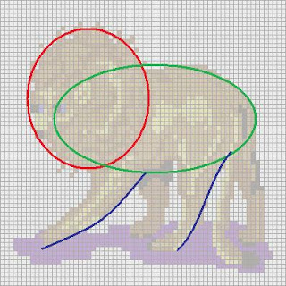
Want to do your own needlepoint design, but you’ve never drawn a thing in your life, and you’re too scared even to try? Having managed to get over the fear of the blank page, you took the plunge, but your untrained hand and eye are too inexpert to get even close to what you have in mind? Using...More......a simple (and often freely pre-loaded) graphics program, such as Microsoft’s “Paint,” could help liberate you. If you aren’t able to do even simple geometric shapes—necessary for giving your design solid believable structure and proportions and for setting it convincingly in space—using just such a program is a must. If you have a bit of familiarity with using menu-driven programs, then you’ll have no trouble learning how to use Paint…just play a bit at first, and learn while playing.

When I do designs freehand, even when inspired by images in other books, I, too, establish the principal forms using geometric shapes, first, as you can see in this after-the-fact mock-up. My original design for the lion, featured in the “composite” design and inspired by that marvelous E. Bradley book on Victorian needlepoint, was done long ago, and I didn’t save the first version with the geometric shapes.

This image was created using a washed-out image of the gridded StitchPainter image, so you can see how the geometric shapes relate to the final design, as featured in my blog post of July 11, 2010 (http://arsacupicturaestellae.blogspot.com/2010/07/king-of-beasts-5-of-9.html).

Do the initial geometric shapes in a bright easily visible color that will not be a part of your final design. It will make it easier to distinguish the initial geometric shapes from your desired shapes (and replace them, bit by bit, with the desired colors), as you elaborate the drawing.

Once the drawing is done, you can print it out, and trace the design directly onto your canvas (see my post: “Designing: transforming your photos into a needlepoint design…start simply!,” dated July 4, 2010). If you need to import it into your needlepoint gridding program, that’s stuff for another blog post.

Saturday, July 17, 2010

Shading patience

Working in the three tones of light-medium-dark, it's usually possible to get good results without being too tedious to plan, acquire yarns (oh, the omnipresent worry about tag-end leftovers), and stitch. Four tones probably would be even better,...More......but even my patience has its limits.

Furthermore, the colors of Paternayan are grouped in small batches of 5, and, at the light end of the tones, the difference may seem visible on the color card, or even when laying hanks next to each other, while stitched may "disappear" discouragingly, after all that work (though the differences, not consciously perceived, still may contribute to enlivening the design).

Similarly, at the dark end of the tones, the difference between the 4th and the 5th color may not seem startling, but might turn into an eye-popper once stitched. I encountered the first situation in the skin tones of my Justinian and Theodora needlepoints (my second ever projects), while the second is evidenced in the mantle of Justinian (http://arsacupicturaestellae.blogspot.com/2010/06/adopting-images-in-mosaics-surprisingly.html).

Though the finished product is still good, working the designs always is an excellent way to learn new lessons, to refine sensibilities. Especially if the project is going to be large and costly, it's a good idea to work good-sized test patches of the color combinations, first.

Friday, July 16, 2010

Composite frame with ribbon and twisted rope motif


Apparently, it is possible to sew small fragments of needlepoint canvas together (overlap at least two complete rows of canvas on each piece, and needlepoint them together as you go), or so I have read, but,...More......never having tried it, it seems to me like it would be unstable. Instead, this design is a fictive composite design.

My inspiration for these images, designed by me freehand on my StitchPainter program, was—as usual—the Victorian needlepoint book (see bibliography and link list). If you like this kind of style, I highly recommend that you buy this book. If you’re like me, you’ll spend happy hours reading about and dreaming of needlepoint!

Remember that, in my designs, the colors are not necessarily indicative of what is to be stitched, but often brighter and maybe even completely different on the diagram to help my eyes distinguish the colors of the little squares, while reading the diagram and stitching. Particularly for certain areas, for example, border patterns, hair and clothes, the indication of the color, in itself, on the diagram is less important than the placement of light-medium-dark tones. Choose your own colors, to go with your taste, or interior decorating scheme.

Thursday, July 15, 2010

Garland of roses (9 of 9)


The last of the small "insets" for the "composite" image is this beautiful garland of roses. This little design--planned for 18-count canvas--will be a bigger, if stitched on lower-count canvas, and so could be made into a little purse, for example. Two of the little designs worked side-by-side into a single work could become a case for glasses, or a cell phone. As smaller designs, they also really can be stitched on leftover pieces of canvas, and can function as insets, even in other projects. (As usual for this "composite" image, I drew the design freehand on my StitchPainter program, and was inspired by the Victorian needlepoint book; see bibliography and link list.)

Wednesday, July 14, 2010

Cat and mouse (8 of 9)


Of course my favorite animal, the cat, had to figure in the "composite" image. (It, too, was designed freehand on my StitchPainter program, and inspired by the Victorian needlepoint book; see bibliography and link list.)

The "composite" frame will be available in the message to be sent on July 16, 2010.

Tuesday, July 13, 2010

Swan (7 of 9)


A peaceful gliding swan (designed freehand on my StitchPainter program, and inspired by my Victorian needlepoint book; see bibliography and link list) for the "composite" image.

Monday, July 12, 2010

Parrot (6 of 9)


A bright and squawking parrot (designed by me freehand on my StitchPainter program, and inspired by the Victorian needlepoint book; see bibliography and link list) for the "composite" image.

Sunday, July 11, 2010

King of the beasts (5 of 9)


Fifth design small in size, but regal: the king of beasts, a gorgeous full-maned lion (designed freehand on my StitchPainter program for the "composite" image, and inspired by the Victorian needlepoint book; see bibliography and link list).

Saturday, July 10, 2010

Cornucopia (4 of 9)


A horn of plenty. How could such a positive good omen lack in the composite image of 9 small images (all inspired by the Victorian needlepoint book, but designed freehand by me on the StitchPainter program; see bibliography and link list) set within a decorated "frame."

Friday, July 9, 2010

Roses in a basket (3 of 9)


The third of nine small images-all designed by me freehand on StitchPainter, and inspired by the Victorian needlepoint book (see bibliography)-for the "composite" needlepoint. Roses seem to pop up frequently in Victorian epoch designs.

Thursday, July 8, 2010

How much is that doggie in the window? (2 of 9)


An adorable little King Charles Spaniel, designed free-hand as all mine are that are inspired by the Victorian needlepoint book (see the bibliography), for the "composite" image with 9 small squares surrounded by a decorated frame.

Wednesday, July 7, 2010

Circus Circus: palomino pony (1 of 9 small designs)


In honor of the circus televised from Montecarlo, here is a palomino pony inspired by my Victorian needlepoint book, ever a font of inspiration (see bibliography). I designed it for a multi-image decorated “composite frame” that eventually will hold 9 such small designs. Keep in mind that, not only can the colors be changed to suit your tastes, but also that sometimes the colors in the design are chosen just for their contrast and visibility, while reading the chart.

Tuesday, July 6, 2010

Designing: Importing digital images into StitchPainter


Now that you’ve started to get a good grip on composition and structure, you might want to try importing images into a needlepoint design program. Here’s...More......the same rose that figured in my recent message on outlining the principal shapes and tracing them directly onto the canvas.

“Ooooh, it looks great!,” you might (hopefully) be tempted to say. Yes, it does. It also turns out to be very complicated to stitch because there are at least ten separate colors just in the rose.

Matching those virtual colors with available yarn colors (something else to keep in mind while designing your needlepoint!) turns out to be less difficult than one might expect. At least with the “gold” version of StitchPainter2, an add-on feature allows you to identify the corresponding DMC yarn color (though, since the last program update was, I think, a few years ago, some of the colors in the module may no longer be available). That, for me, still poses a problem because I work in Paternayan yarns, and—though I asked years ago—they still haven’t come up with a Paternayan color module. Yes, I could look up a corresponding color on charts, but, personally, I really don’t want to have to deal with 10 separate colors for each and every part of my designs.

I prefer to try to work with three, sometimes four shades per color, going from light through medium to dark. That means that I have to do a lot of tweaking of images imported into the needlepoint program. In StitchPainter, some of the tweaking can be done across the board (switching one color for another, for example), while some tweaking has to be done square-by-square (for example, cleaning up edges). It is possible to force the program to use fewer colors, but, at least in my experience, the image doesn’t come out well, so there is a lot of square-by-square tidying that is so much like doing the needlepoint, itself, that I feel like I’ve done it, already, when I’ve only finished the design!

Monday, July 5, 2010

From whence cometh my profile picture?

From whence cometh my profile picture? It’s a detail of an...More......18” prayer cushion that I made for a friend, who is very religious. The design is based on the ceiling of the (so-called*) Mausoleum of Galla Placidia in Ravenna, Italy (for a pretty good, but slightly dark, photo available online, though not the source of my work, see: http://www.flickr.com/photos/breic/197358235/) of the 5th century A.D., in the Early Christian period.

I used just the central crucifix and surrounding “crystal” spheres into which the heavenly stars were suspended (according to ancient and medieval astronomy), without the figures of the Four Evangelists (which would have ended up too stylized in such a “small” image).

If you are going to Italy, and love gorgeous art, I highly suggest spending a few days visiting the mosaics in the Early Christian and Byzantine churches in Ravenna!

Not wanting to put my own portrait photo online, for reasons of privacy, I realized that a detail of the starry sky of my needlepoint would be a perfect icon for my profile.

The design is a good example, too, of being liberally inspired by an image, without copying exactly…I drew the circles on my canvas with a compass, and positioned the stars freehand.

(*The building was not identified as a mausoleum, nor are there any records of the sarcophagi, until the 9th century A.D. and the Carolingian epoch, fixated, as it was, for important political, cultural and religious reasons, on relics. The little cruciform building—now a good three yards/meters shorter, due to the build-up of dirt and detritus over the centuries—was, in my opinion, a sacristy; see my M.A. thesis, 1983, on the So-Called Mausoleum of Galla Placidia, thesis advisor Dr. D. Brinkerhoff, Univ. of California at Riverside)

Sunday, July 4, 2010

Designing: transforming your photos into a needlepoint design...start simply!


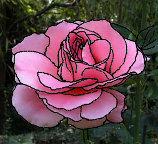
Even if you have a needlepoint program, and especially if you've never taken art lessons, it's a good idea to start doing your own designs by...More......tracing over a photo. Why? because it helps you concentrate on the STRUCTURE of the object in question, a fundamental feature to achieve convincing results, as opposed to being bewitched by small details. It also helps you realize just how complicated translating a photo into a design is, so it helps you learn to pick images that better lend themselves to this transformation.

In this photo I snapped a couple of years ago, I outlined for you the principal structural parts of the flower, stem and leaves (choosing to leave out the smaller leaf in perspective, as it would be harder to understand in a needlepoint). The larger areas of shadow and light also have been outlined because they are indicative of structure. Smaller details, such as teeny defects in the lips of the petals, were ignored. If you have a spare copy of the photo, you can outline directly on it. If you don't, and if there's nothing confusing on the other side of the page, you can put the photo up against a sunny window, put a piece of tracing paper over the photo, and trace on the tracing paper. Once this is done, set down the photo, put the traced design against the sunny window, and your canvas over the traced design. KEEPING STITCHING TECHNIQUE IN MIND, trace the design in pencil, or waterproof felt-tipped pen (beware that dark colors of pen might show through a light-colored yarn!).

What do I mean by keeping stitching technique in mind? See my post and diagram on stitching techniques.

Saturday, July 3, 2010

Designing: places to start


So, you want to make a needlepoint. You even have an idea about what it will become after being finished, AND you know to whom you'd like to give it. These two things already will...More......influence the design, itself. Let's say you've even settled on a subject, and have an idea about how you'd like the composition to be. Where to turn, next, in the absence of a pre-fab kit? Though a perfectly viable alternative--one got me hooked on needlepoint after all!--as I've mentioned it's so much fun to design one's own.

Looking through books of needlepoint patterns helps (if you're a beginning, I'd put off translating complicated images, such as a photo of your kid with his/her first b-day cake smeared everywhere but in his/her mouth).

Start with something simple, such as this little hand-done Xmas tree. If you have trouble drawing, then get yourself a kid's coloring book with the desired images in it, or hunt on the web. Once you have the image you want, you can trace it directly onto your canvas WITH A PENCIL, OR A WATERPROOF PEN, up against a window, in absence of a light box. It's a bit tiring, but works great.

Always remember to figure your initials and the year into the design from the very beginning!

Friday, July 2, 2010

Viewing this blog

After all the care I dedicated to picking out a blogspot.com background suitable for this blog on needlepoint, I saw on a friend's computer that it wasn't viewed correctly, probably because her browser is (very) old. What does my friend see? The active window seems to have all the features of my blog (posts+pics, bibliography, etc.), but there is no dotted background so expressive of needlepoint in a fun way.

I have an updated browser, and view the screen at 1200 x 800 pixels. I correctly see the blog: generous outer margins of Persian blue with light Persian blue dots in which is set the active light-colored window through which can be seen the background, faintly.

I hope you see the blog, as I do!

Thursday, July 1, 2010

Strawberry fields


Here's the border of strawberries shown in an earlier post, but with the center empty, and ready for your own design. Already marked with "10" for the year, don't forget to add your own initials where the place markers "XX" are!
Related Posts Plugin for WordPress, Blogger...